Layton ServiceDesk - Configuring the System - Form Design
![]() Previous article in this series: Data Design
Previous article in this series: Data Design
Overview
All key forms or screens displayed in Layton ServiceDesk are customizable. This means that field names or labels may be changed, fields moved using drag-and-drop, and database fields removed or added as required. New data fields that you wish to add to a form must first be created in Data Design.
Each form is edited in the same way. To move an object, click the small square handle in the top-left corner and drag it to the desired location on the form. This method may be used to modify the location of field labels, field positions, buttons, and icons. Any label, field, drop-down list, or image may be displayed and modified by selecting the object and amending the properties of that object. The default Analyst Request form as displayed in the form design mode is seen below:
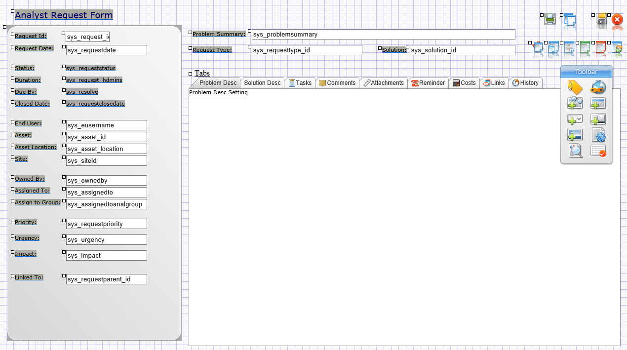
A tool bar is provided to define new objects for the form by adding labels, new user-defined fields, drop-down lists, system fields, read-only fields, hyperlinks and images. Additional Toolbar icons provide Page Properties, Preview Mode, Snap to Grid and Exit. The Toolbar is originally positioned on the right side of all forms but can be moved to anywhere on the form by dragging the top of the Toolbar. Position the mouse over each Toolbar icon to see the various options. See below for a detailed description of the Toolbar options.
Note: All changes made in the Form Designer are live and take immediate effect for users. There is no Save button to commit form-design changes.
Using the Form Design Toolbar
Toolbar Overview
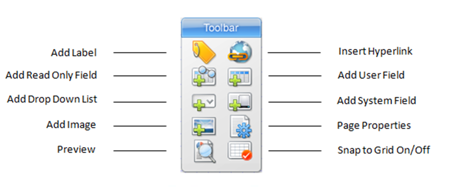
After the form is selected from the Admin Site Map Form Design menu, the form is displayed with the floating Toolbar pictured and described below:
The Toolbar provides you with access to the different form elements and properties. User Field, System Field and drop-down lists are all data bound elements that input data to fields in the bound table. Labels are static text on the form. Images allow static images to be placed on the form and Page properties allow for the configuration of the form's background color.
Label Elements
Although static text, label elements can be made to display system terms as defined in the Application Terms section. To configure a label to dynamically display a system term, specify the term inside double curly braces in the label value property of the label. When displayed on the form, the bracketed term will be replaced with the system term.
For example:
{{user}} ‐ Analyst
{{enduser}} ‐ End User
{{request}} ‐ Request
{{requesttype}} ‐ Request Type
A full list of the available system terms are defined in Application Terms.
Adding a New Field
To add a new field label, select the Add Label icon from the toolbar and set the properties and press “Save”. The field label will now appear at the top left corner of the screen. Simply grab the small square handle at the top left corner of the label and drag the label to the required position on the form.
The “Snap to Grid” icon on the Toolbar is used to define the number of pixels between position settings on the form and helps with the alignment of fields and labels. The pixel setting is defined in Administration | Form Design | Settings.
User Data Field
User-defined fields created in Data Design.
System Field
Pre-defined system fields available for this form.
Field Combo
A Field Combo presents the contents of a Drop Down List as a drop-down menu. The value is mapped to a user-defined field in the requests table.
Before you add a Field Combo, define a Drop Down List and Add a user-defined field to the request table.
Click the Add Field Combo button ![]() on the Toolbar. The Field Combo Properties page will open.
on the Toolbar. The Field Combo Properties page will open.
Properties
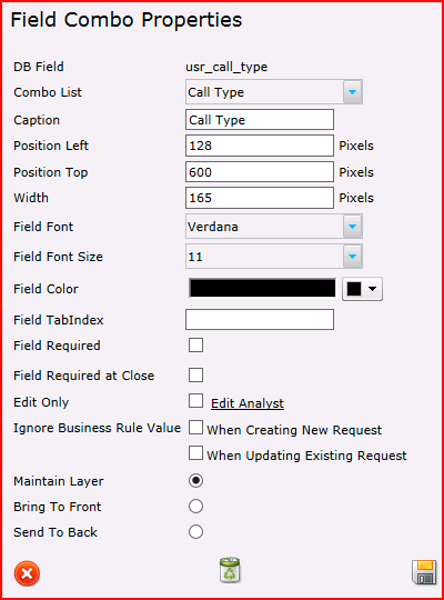
DB Field
A user-defined field that will store the value of the Field Combo.
Combo List
The Drop Down List that will provide the values.
Caption
A text value used as an internal reference. If the Field Required options are set, an error dialog will appear if the Request form is saved and the field is not populated. This caption is used in the error dialog to indicate which field needs to be populated, e.g.:
You must enter a value in the "User's Current Location" field.
As of version 6.6.5, when creating or editing a field, a caption must be entered. If the field was added prior to 6.6.5 and a caption was not entered at the time, the field name will appear in the dialog, e.g.:
You must enter a value in the "usr_location" field.
Position Left
The number of pixels from the left side of the browser window that the Field Combo will be placed.
Position Top
The number of pixels from the top of the browser window that the Field Combo will be placed.
Width
The number of pixels wide.
Field Font
The font used for text in the Field Combo.
Field Font Size
The font size used for text in the Field Combo.
Field Color
Defunct setting.
Field TabIndex
The sequence of fields that are entered when the Tab key is pressed can be defined. It is suggested that the whole form be viewed, and the tab sequence worked out before clicking fields and altering this setting.
Field Required
When enabled, the field must be populated in order to save the Request.
Field Required at Close
When enabled, the field can be null when first saving and subsequent modifying of the Request, but it must be populated in order to close the Request.
Edit Only
Specific Analysts can be given permission to edit the Field Combo.
Ignore Business Rule Value When Creating New Request
If a Business Rule would change the value of the field, this setting will ignore it when the Request is created.
Ignore Business Rule Value When Updating Existing Request
If a Business Rule would change the value of the field, this setting will ignore it when the Request is updated.
Maintain Layer
The Field Combo will remain in the stacking hierarchy.
Bring to Front
On saving the Field Combo Properties, the field will be raised to the highest level in the stacking hierarchy.
Send To Back
On saving the Field Combo Properties, the field will be lowered to the lowest level in the stacking hierarchy.
Read-Only Field
Fields from other tables. These fields are presented as text on the page and are not fields that can be entered and edited.
Editing Objects
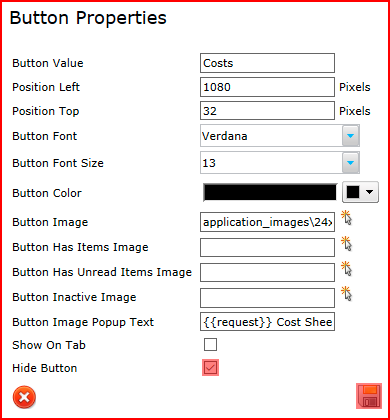
Any object; labels, data fields or button images, can be amended by simply selecting the object within the form. The properties of that object will be displayed for you to edit as required and select “Save” to return to the form design screen.
Hiding Buttons
Buttons can be hidden by checking the option Hide Button in the Properties:
Adding Images
You can add static images to forms by selecting the Add Image button on the Toolbar. This will launch a pop up control which allows you to browse to the image location (see Figure 10 below). All Layton ServiceDesk images are held in the Application Images folder and it is recommended that any custom user images be placed in the Application_Images/User sub-folder.
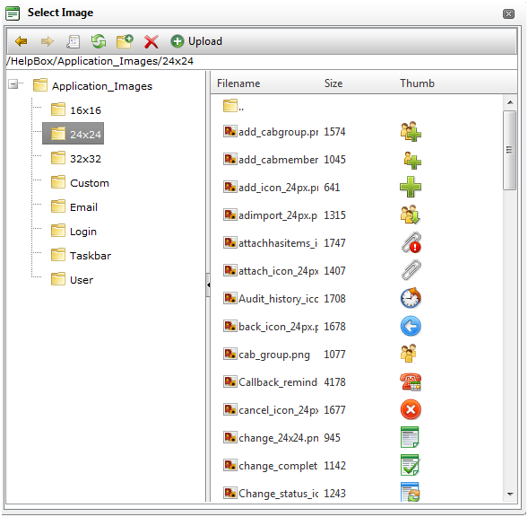
To add upload an image to the User images folder click on the User folder location and then click on the Upload button in the menu. This will display another window where you can browse to the image location. Once the image location has been specified click the upload button and the image will be uploaded into the User folder. To select the image double click on the image name.
Each element on the Form has a layer order. You have the ability with images to bring them to the front of the layer or send them to the back of the layer. Sending them to back will cause the image to appear behind other elements. Bringing it to the front will cause the image to appear in front of other elements. By using the Maintain Layer option the image layer is left where it is. To change the layer details click on the image to view the image properties.
Adding Hyperlinks
Hyperlinks can be added to any form by clicking the Add Hyperlink button ![]() . Hyperlinks allow you to create links to external documents or applications and also be able to pass the values of form fields as a query string in the URL. For example a hyperlink in the request form can be made to link to an external web application and pass in the value of the sys_request_id field in its query string. Hyperlinks can be made to display in three ways; in a new window, replacing the entire Layton ServiceDesk view or display the linked document in the current frame.
. Hyperlinks allow you to create links to external documents or applications and also be able to pass the values of form fields as a query string in the URL. For example a hyperlink in the request form can be made to link to an external web application and pass in the value of the sys_request_id field in its query string. Hyperlinks can be made to display in three ways; in a new window, replacing the entire Layton ServiceDesk view or display the linked document in the current frame.
Although static text by default, hyperlinks can be made to display system terms as defined in the system configuration section. To make a hyperlink display a system term specify the term inside {{ }} in the hyperlink caption property. When displayed, the bracketed term will be replaced with the system term.
System Term Mapping
| Token | System Default Term |
|---|---|
| {{user}} | Analyst |
| {{enduser}} | End User |
| {{request}} | Request |
| {{requesttype}} | Request Type |
| {{solution}} | Solution |
| {{eclient}} | Department |
| {{action}} | Action |
| {{actiontype}} | Action Type |
| {{priority}} | Priority |
| {{site}} | Site |
| {{company}} | Company |
Properties
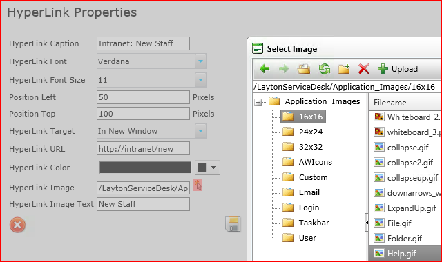
HyperLink Caption
The text that will appear on the form as a text link.
HyperLink Font
The font in which the text link will appear.
HyperLink Font Size
The font size in which the text link will appear.
Position Left
The position, in pixels, from the left side of the browser page that the hyperlink will be placed.
Position Top
The position, in pixels, from the top of the browser page that the hyperlink will be placed.
HyperLink Target
The hyperlink can be loaded in a number of ways, two of which affect the state of Layton ServiceDesk pages.
| Setting | Description |
|---|---|
| In New Window | The hyperlink will be loaded in a new browser window. |
| Replace | The hyperlink will be loaded in the current browser window, replacing Layton ServiceDesk. |
| In Frame | The hyperlink will be loaded in the frame of the current browser window in which it appears, replacing that part of Layton ServiceDesk. |
HyperLink URL
The URL that will be loaded when the hyperlink is clicked.
The HyperLink URL property can be specified to pass dynamic query strings to the linked document. This can be very powerful as it can allow Layton ServiceDesk to talk to external applications. To make a hyperlink URL carry Layton ServiceDesk form values, specify the fieldname inside [[]] in the hyperlink URL property. When clicked, the bracketed field name will be replaced with the field value. For example, the Request ID in the form of the SQL column name:
myownwebapp.asp?request=[[sys_request_id]]
would be passed as:
myownwebapp.asp?request=77
HyperLink Color
The text color in which the text link will appear.
HyperLink Image
The hyperlink can be configured as an image instead of a text link. Any existing system image can be chosen. If a custom image is desired, it should be copied to:
C:\Program Files\Layton Technology\Layton ServiceDesk\Application_Images\User\
To specify an image, click the Select button ![]() and navigate to it in the Select Image dialog, then double-click the desired image.
and navigate to it in the Select Image dialog, then double-click the desired image.
HyperLink Image Text
The text that will appear if the mouse cursor is hovered over the hyperlink image.
HTML Editor
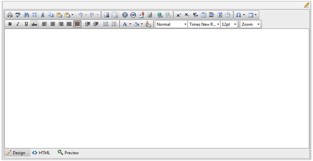
The HTML editor tool provides for easy WYSIWYG HTML formatting and includes a range of functions such as Spell Checking and adding Hyperlinks. The HTML editor control is designed to be used with large text fields such as the Problem Description and Solution Description fields. If you have created your own user defined text field and would like to apply the HTML editor control to your field then in the Form Design section click on your user defined field and in the field properties section select the HTML Editor radio button and specify the Editor Width and Height (in pixels). The minimum recommended size is 600 x 300 pixels.
Once the HTML editor has been added to the form it can be dragged to the required position on the form like any other field by selecting the handle on the top left of the field. Please note that to protect users' private information, unprivileged scripts cannot invoke the Cut, Copy, and Paste commands in the Mozilla, Safari / Chrome and Opera rich text editor, so the corresponding buttons will not work. You can cut and paste content in Firefox, Safari /chrome and Opera only using the Ctrl+X and Ctrl+V shortcut or the Paste from Word dialog. You can also paste content from the browsers menu: Edit -> Paste.
See Figure 11 below for a sample of the HTML editor control.
Web Tab
The Web Tab feature provides for the quick and easy viewing of items such as Tasks, Comments and Attachments, without having to click through to another page. The Web Tab is available on the following forms:
- Analyst Request
- End user Request
- Spawn Request
- Problem
- Change
- Solution
- End User Solution
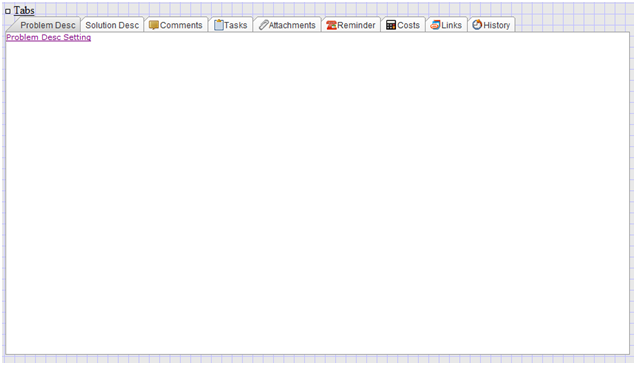
Elements that Can Be Configured as Web Tabs
On these forms the following system buttons, system fields and user defined fields can be added or removed from the Web Tab:
Analyst Request & Spawn Request Forms
- Problem Description (sys_problemdesc)
- Solution Description (sys_solutiondesc)
- Comments Button

- Tasks Button

- Attachments Button

- Reminder Button

- Costs Button

- Links Button

- History Button

End User Request
- Problem Description (sys_problemdesc)
- Solution Description (sys_solutiondesc)
- Comments Button

- Attachments Button

Problem Form
- Problem Description (sys_problem_description)
- Problem Cause (sys_problem_cause)
- Solution Description (sys_solution_description)
- Comments Button

- Tasks Button

- Attachments Button

- Reminder Button

- Costs Button

- Links Button

- History Button

- Change Form
- Change Description (sys_change_description)
- Change Impact (sys_change_impact)
- Change Implementation (sys_change_implementation)
- Change Rollback (sys_change_rollback)
- Comments Button

- Tasks Button

- Attachments Button

- Reminder Button

- Costs Button

- Links Button

- History Button

Solution Form
- Problem Description (sys_problemdesc)
- Solution Description (sys_solutiondesc)
Items can be removed from the web tab by selecting the settings link under the relevant tab and un-checking the Show on Tab check box. Once removed from the Web Tab the item can be moved to the required location on the form by dragging the handle of the field in the top left corner. If the field is not visible on the form after removing it from the web tab it may be hidden behind the Web Tab. Simply drag the whole Web Tab aside to reveal the field which you can then move to the required location.
To set the properties of the Web Tab click on the Tabs text in the top left hand corner of the Web Tab. You can set the font and font size of the tab labels and the height and width of the Web Tab.
If you do not wish to use the Web Tab and would prefer to have all buttons and fields displayed independently on the form, remove all fields from the Web Tab as described above and then click on the Page Properties icon and un-check the Show on Tab option.
Summary of Form Objects
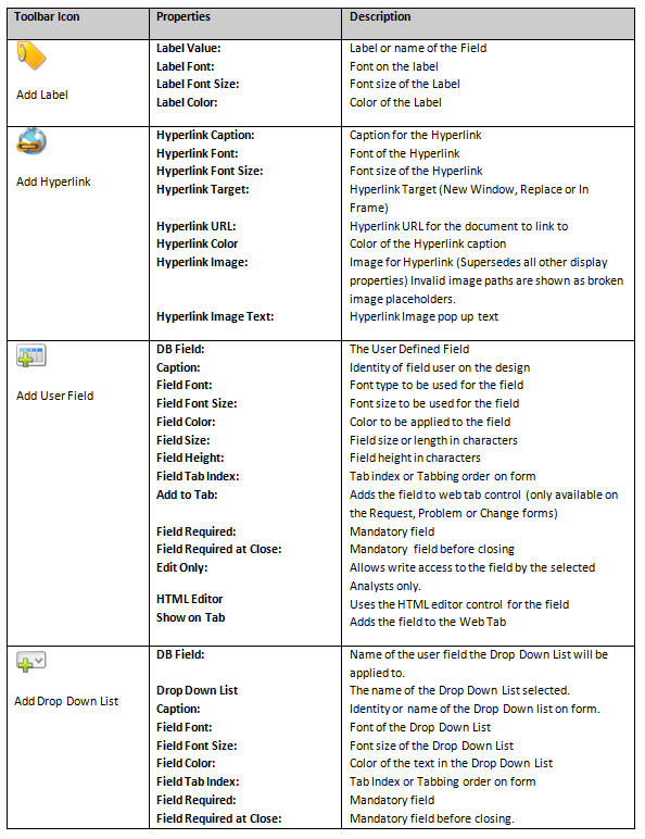
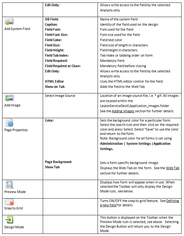
Figure 13 - Summary of Form Objects
Modifications
Modifying a Tab Name
It's possible to change a tab name (e.g. Problem Desc).
- Click the tab, then click TABNAME Setting in the body of the tab.
- Change the value of the Caption field.
- Click the Save button
 .
.
Request Type as Multiple-Level Menu
By default, Request Type is represented as a field with the Select button ![]() which, when clicked, opens a dialog where you can pick the Request Type from a tree. Alternatively, you can configure the form to represent the Request Type as a series of drop-down menus. Add more than one instance of the system field sys_requesttype_id to the form. You can add as many as you like to represent the number of levels in your Request Type hierarchy. The form hierarchy is established by placing the fields below each other.
which, when clicked, opens a dialog where you can pick the Request Type from a tree. Alternatively, you can configure the form to represent the Request Type as a series of drop-down menus. Add more than one instance of the system field sys_requesttype_id to the form. You can add as many as you like to represent the number of levels in your Request Type hierarchy. The form hierarchy is established by placing the fields below each other.

To determine the number of instances of sys_requesttype_id, run this query in Management Studio:
   SELECT    TOP(1) sys_requesttype_depth + 1 AS "No. of Fields to Add"

   FROM      requesttype

   ORDER BY  sys_requesttype_depth DESC
When filled out on the form, each field will populate with only those values applicable to the level above it. You do not need to fill each of the fields on the form.

