Layton ServiceDesk - Settings - Form Design - End User Request
From Layton Support
Overview
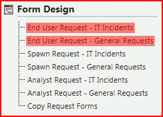
There is a form design screen for every Request Class that you have configured. In this example, the Administration page shows two forms, IT Incidents and General Requests:
Note that there is always at least one Request Class, and by default, its ID is IT Incidents. Any change made to the form for this Request Class will be copied to any new Request Classes on creation. All new Request forms are based on the one for the default Request Class.
This is the design view for End User: General Requests:

Change Request Status Button
Clicking the Change Request Status button  opens its properties:

Settings
| Value | Description | Default Value |
|---|---|---|
| Button Value | A name used to refer to the form element. | Change Status |
| Position Left | The position, in number of pixels, that the button is located from the left of the window edge. | 776 pixels |
| Position Top | The position, in number of pixels, that the button is located from the left of the window edge. | 64 pixels |
| Button Font | You can choose to use a rectangular button with a text label rather than an icon. Deleting the Button Image value (see below) will change the button to a text one. This setting is intended to control the font but is not currently in use. | Verdana |
| Button Font Size | This setting is intended to control the font size but is not currently in use. | 13 |
| Button Color | This setting is intended to control the color but is not currently in use. | Black |
| Button Image | Choosing an image will present the button as an icon rather than a text button (see above). | Application_Images/24x24/Change_status_icon_24ds.png |
| Button Has Items Image | You can specify a different image to indicate that the function related to the button has items, such as the presence of attachments. Not used for this button. | Empty |
| Button Has Unread Items Image | You can specify a different image to indicate that the function related to the button has items that are new and have not been viewed, such as new comments. Not used for this button. | Empty |
| Button Inactive Image | Indicates that the button will not do anything if clicked. Not used for this button. | Empty |
| Button Image Popup Text | The text that will appear when the pointer is hovered over the button. | Change Request Status |
| Hide Button | Clicking this checkbox will hide the button on the form. Note that the button is still present in design view. | Unchecked |