Layton ServiceDesk - Dashboard
Contents |
Overview
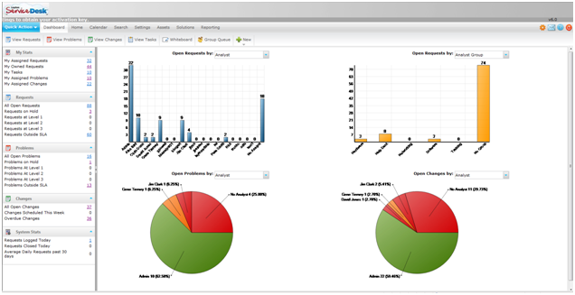
The Layton ServiceDesk Dashboard provides ServiceDesk Managers and Analysts with a quick and easy visual overview of the current state of the ServiceDesk.
The Dashboard charts and statistical data provide all the critical information you need at your fingertips, making the task of monitoring the performance and workload of ServiceDesk that much easier. With the information displayed on the Dashboard you can quickly identify any trends or changes to the service levels and take proactive action.
The charts have a range of filter options which allow you to quickly change views, for example you can see the number of Requests that are open by Analyst, Analyst Group, Priority, Status or Site. All chart components are drill-able and by clicking a data component you will provided with a list view of that data.

Access
By default all Analysts have access to the Dashboard. To turn off Dashboard access for an individual Analyst go to Administration | Company Structure | Manage Analyst | Analyst Settings | Access Restrictions | Dashboard Access.
Charts
The two charts at the top of the Dashboard will display data based on Open Requests. The grouping is based on the filter section above the chart. The chart grouping options are by Analyst, Analyst Group, Company, Site, Department, Priority and Status.
The chart in the bottom left hand corner will display data based on Open Problems. The grouping is based on the filter section about the chart. The chart grouping options are by Analyst, Analyst Group, Site, Priority, Status, Impact and Urgency.
The chart in the bottom right hand corner will display data based on Open Change. The grouping is based on the filter section about the chart. The chart grouping options are by Analyst, Analyst Group, Change Type, Status, Impact and Urgency.
Problem & Change
By default the Layton ServiceDesk system has the Problem & Change management functions enabled. If your service desk system does not require the Problem & Change management functions they can be disabled by going to Administration | System Settings | Application Settings | Enable Problem and Change.
If the Problem & Change management functions have been disabled the Problem & Change charts will be converted into additional Request charts.
Chart Size
By default, the Dashboard will display two charts side by side:

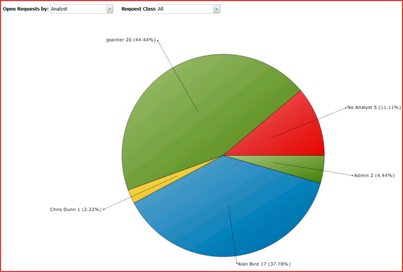
To make it easier to read the labels, the Dashboard Page Size setting can be changed to Large, which will display one larger chart in the same width:

Statistics
The Statics Panels in the left hand pane provide a range of data grouped into five sections; My Stats, Requests, Problems, Changes and System Stats. The Problem & Change management function has been disabled then the Problem & Change panels will not be displayed.
To display a list view of any statistic or chart data component simply click on the chart component or link displaying the number of items.
Whiteboard
The Whiteboard Ticker allows you to publish messages on the system that will scroll across the top of the screen in the banner. This message may be scheduled for a certain date and time with an optional termination date. The message may be displayed for all users including End Users (Public) or just Analysts (Private). Analysts who have been given permission to compose Whiteboard messages can do so from their Main Menu > Home Menu.
The Whiteboard is a very effective way to communicate important information about the current status of services and outages and also to provide details of upcoming scheduled maintenance and other activities. Effective communication can help to reduce unnecessary Requests being logged in the system.