Layton ServiceDesk - Configuring the System - Form Design
Contents |
Form Design
All key forms or screens displayed by the system are user configurable. This means that field names or labels can be changed, fields moved around using “drag and drop” technique and database fields removed or added as required.
New data fields you wish to add to a form should have been created previously using DATA DESIGN. The following is the list of all forms that can be amended using Administration | Form Design and what they are used for:
| Form | Description |
|---|---|
| Copy Request Forms | Allows you to copy a form from another Request Class to expedite the form designing process. |
| Banner | Defines the Banner as shown at the top of the screen. |
| Admin Banner | Defined the Banner as shown at the top of the Administration screen. |
| Survey | Defines the Survey form. |
| Task | Defines the Task form for actions either associated with Requests, Problems, Changes, Recurring Tasks or freestanding. |
| End User Request | Used by the End User to log Requests. Note - If you have multiple request classes defined. A separate form is designable for each Request Class that is defined. |
| Analyst Request | Request form used by the Analyst to log and progress Requests. Note - If you have multiple request classes defined. A separate form is designable for each Request Class that is defined. |
| Spawned Request | Spawned Request form used by the Analyst to log and progress Spawned Requests. Note - If you have multiple request classes defined. A separate form is designable for each Request Class that is defined. |
| Problem | System Settings | Application Settings. |
| Change | System Settings | Application Settings. |
| Analyst | Defines the Analysts Attributes for creating / amending Analysts. |
| End User | Defines the End User attributes for creating/amending End Users. |
| Company | System Settings | Application Settings. |
| Site | Defines the Site form. |
| Department | Defines the Solution form used when creating and displaying Solutions. |
| Solutions | Spawned Request form used by the Analyst to log and progress Spawned Requests. Note - If you have multiple request classes defined. A separate form is designable for each Request Class that is defined. |
| Login | Allows you to change the format of the Layton ServiceDesk™ logon screen. |
| Login End User | Allows you to change the format of the Layton ServiceDesk™ End User logon screen. |
| Login Analyst | Allows you to change the format of the Layton ServiceDesk™ Analyst logon screen. |
| Priority / SLA | Used for defining the Priority / SLA details: times and escalation process. |
| Register End User | Details of what the End User should enter to Register themselves. |
| Search Request | Search parameters for finding and displaying Requests. |
| Search Task | Search parameters for finding and displaying Tasks. |
| Search Problem | Search parameters for finding and displaying Problems. |
| Search Change | Search parameters for finding and displaying Changes. |
| Search Survey | Search parameters for finding and displaying Surveys. |
| Search End Users | Used to search for End Users when logging a new Request or editing. |
| Search End User Req | Search parameters for finding and displaying End User Requests to the End Users. |
Figure 7 - List of Designable Forms
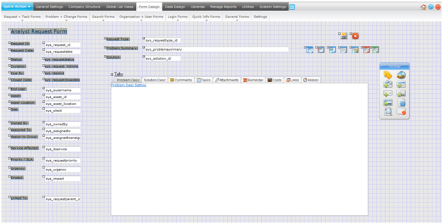
Each form is edited in the same way. Dragging the small square handle at the top left of each object moves the location of field labels, field positions, buttons and icons. Any object; label, field, drop down list or image, can be displayed and amended by selecting the object and amending the properties of that object. The example in Figure 8 shows the Analyst Request form as displayed in the form design mode.

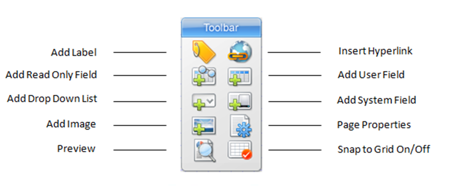
A Toolbar is provided to define new objects for the form by adding labels, new user defined fields, drop down lists, system fields, read only fields, hyperlinks and images. Additional Toolbar icons provide Page Properties, Preview Mode, Snap to Grid and Exit. The Toolbar is originally positioned on the right side of all forms but can be moved to anywhere on the form by dragging the top of the Toolbar. Position the mouse over each Toolbar icon to see the various options. See Figure 9 for details.
- Note: The form is automatically saved immediately each time you make a change, so there is no Save button for changes to any form.
Please also note that any changes to the forms take immediate effect and are visible to users of the system as and when the changes are made.
Using the Form Design Toolbar
Toolbar Overview
Select the form you wish to modify from the Form Design menu. The floating Toolbar (see Figure 9) provides you with access to the different form elements and properties.
User Field, System Field and Drop Down Lists are all data bound elements that input data to fields in the bound table. Labels are static text on the form. Images allow static images to be placed on the form and Page properties affect the back color of the form.

Label Elements
Although static text, label elements can be made to display system terms as defined in the Application Terms section. To make a label display a system term specify the term inside {{ }} in the label value property of the label. When displayed on the form the bracketed term will be replaced with the system term.
For example:
{{user}} ‐ Analyst
{{enduser}} ‐ End User
{{request}} ‐ Request
{{requesttype}} ‐ Request Type
A full list of system terms are defined in the Application Terms section.
Defining a New Field
To add a new field label, select the Add Label icon from the toolbar and set the properties and press “Save”. The field label will now appear at the top left corner of the screen. Simply grab the small square handle at the top left corner of the label and drag the label to the required position on the form.
The “Snap to Grid” icon on the Toolbar is used to define the number of pixels between position settings on the form and helps with the alignment of fields and labels. The pixel setting is defined in Administration | Form Design | Settings.
Now select one of the icons to add the required data field, either:
- Add User Data Field ‐ user defined fields, must previously have been added using DATA DESIGN.
- Add System Field – pre defined system fields available for this form.
- Add Drop Down List – any pre defined Drop Down List which is then applied to a user data field.
Whichever option is selected they all act in the same way. Select the required data field from the DB Field pick list and set the required properties (see Figure 13 - Summary of Form Objects). Then select “Save” to return the form design screen.
- Add Read-Only – provides support for adding display only fields from other tables on the form being designed. Read-Only fields will appear as labels on the form.